
Challenge
Ignited USA, I was hired as a UX designer on a team of talented designers. We were tasked to convincingly demonstrate to top executives of potential clients, like CEOs, CMOs, and VPs of marketing companies, how Ignited's innovative advertising approach could be a game-changer in achieving their business objectives. Our goal was to articulate and showcase Ignited's distinct marketing strategies in a way that resonated with these high-level decision-makers.
Process
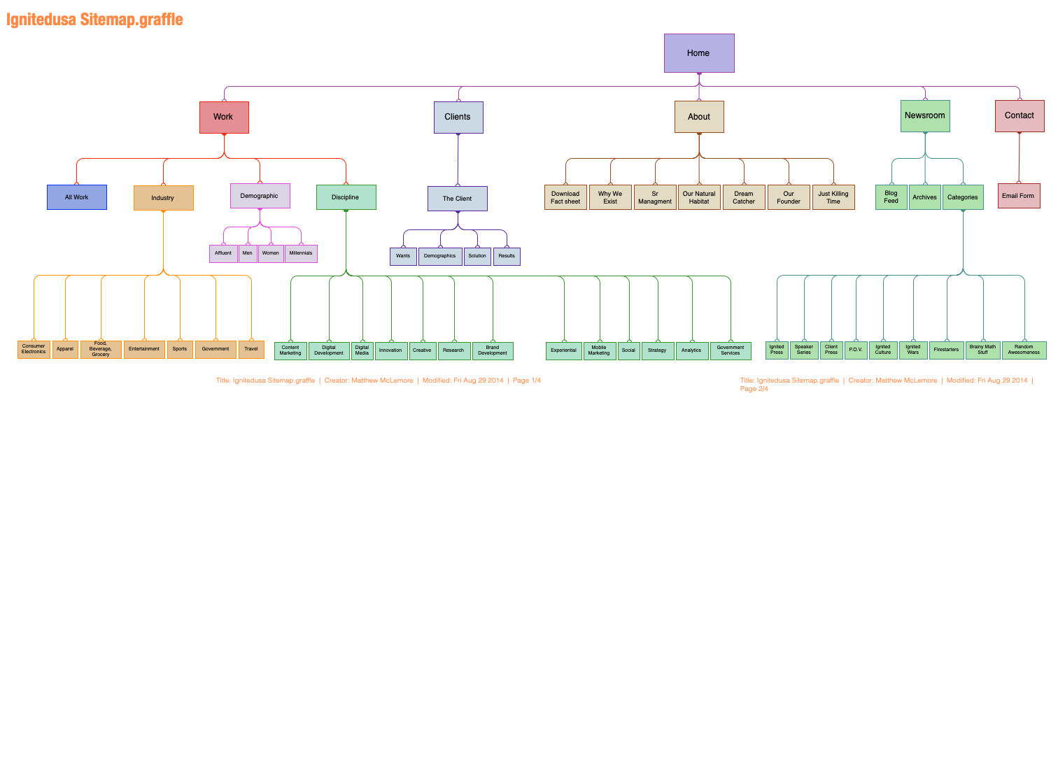
My strategy for UX research began with an in-depth analysis of current site usage, identifying patterns of user engagement and points of drop-off. I developed detailed user personas to accurately define our target market, ensuring our approach was tailored and relevant. The design of a responsive website, optimized for desktop. The site was crafted to enhance session duration and minimize user drop-off. I created a comprehensive user flow, complete with annotated wireframes and a clickable prototype, serving as a blueprint for designers and developers to bring the site to life. A post-launch analytics study was conducted to measure and quantify results.
Results
The outcome was a state-of-the-art, scalable masonry website design. This design strategically weighted and ordered content based on a sophisticated content relationship structure. This approach fostered an organic user flow, encouraging visitors to engage more deeply with content that was directly relevant to their specific demographic needs and industry. The result was a dynamic, engaging online experience that not only captivated our target audience but also demonstrated the unique value proposition of Ignited's marketing approach.
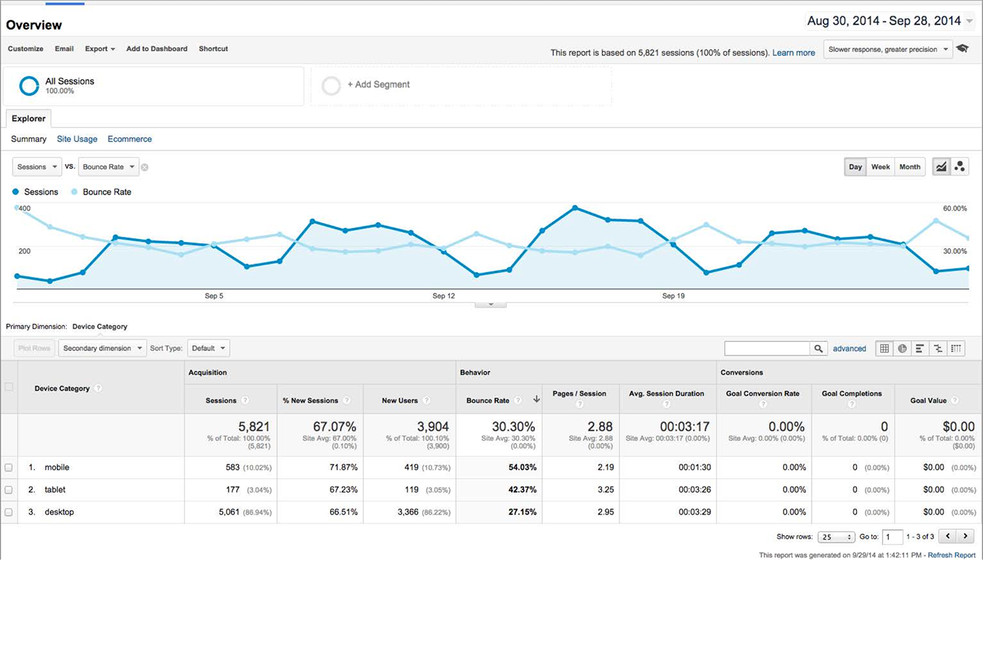
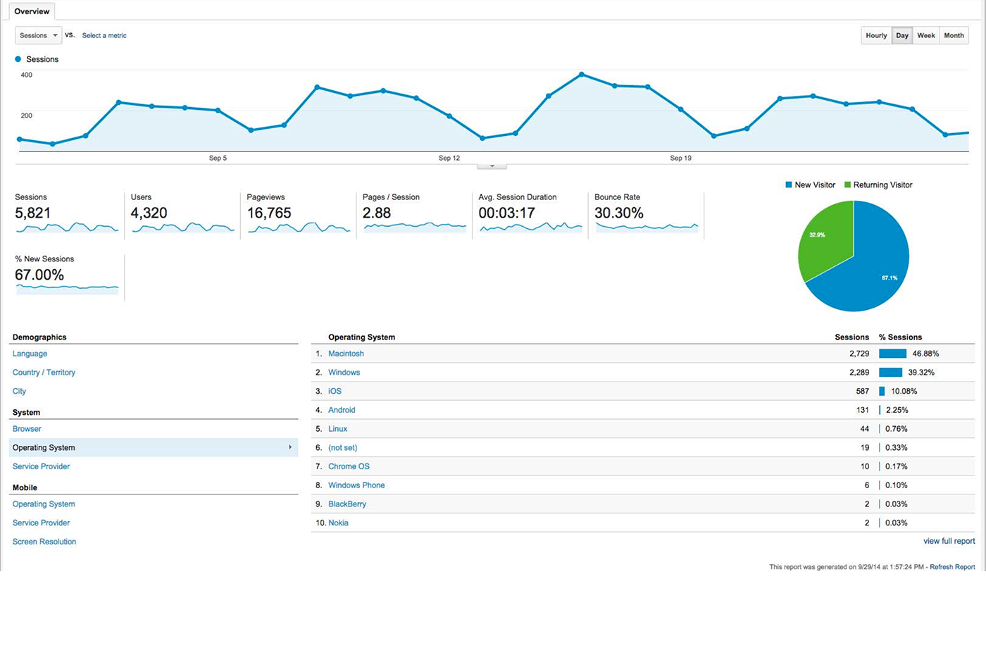
UX Optimization Using Google Analytics
User Behavior: Analyzed Behavior Flow and Pages reports to identify navigation patterns and drop-off points, finding pages with user drop-offs.
Audience Insights: Used Audience reports to understand demographics and device usage, optimizing for mobile users.
Engagement Metrics: Monitored Bounce Rate and Engagement Time to improve pages with high drop-offs via continuous scroll content and navigation.
Site Search Analysis: Reviewed search terms to address content gaps, such as adding sales verticals.
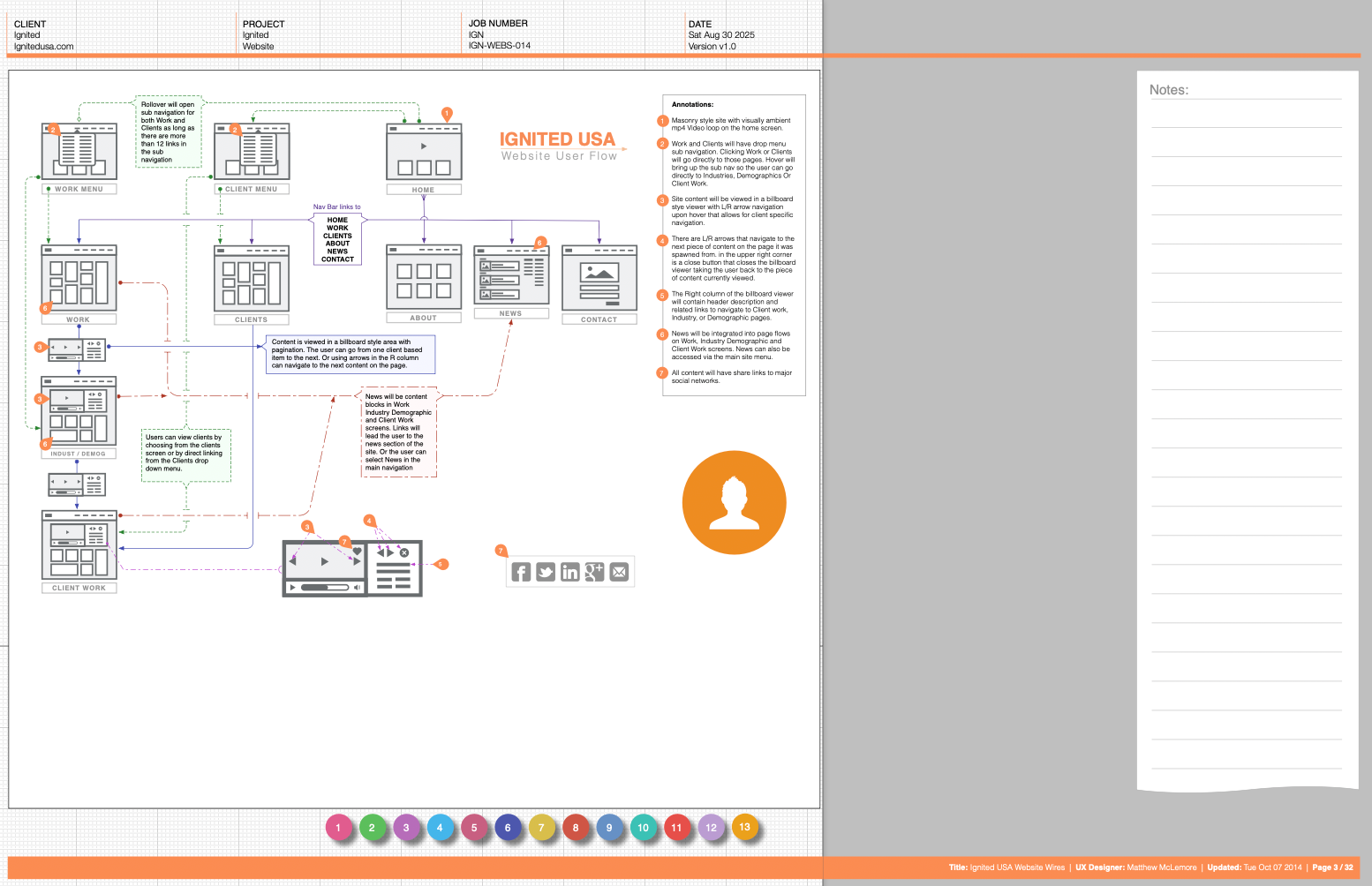
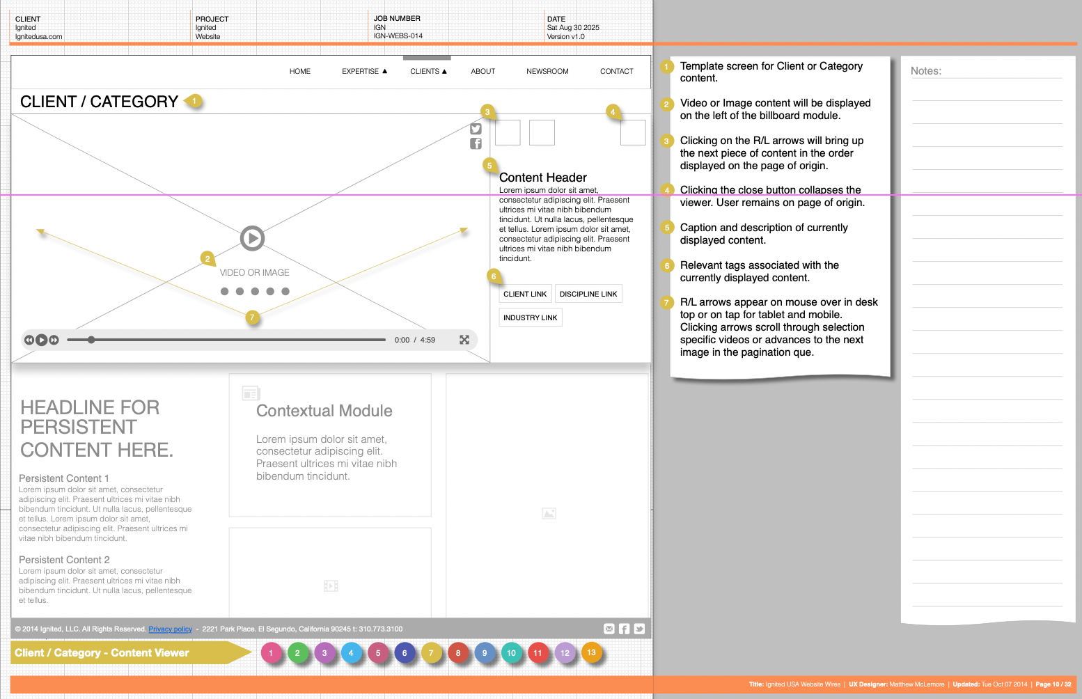
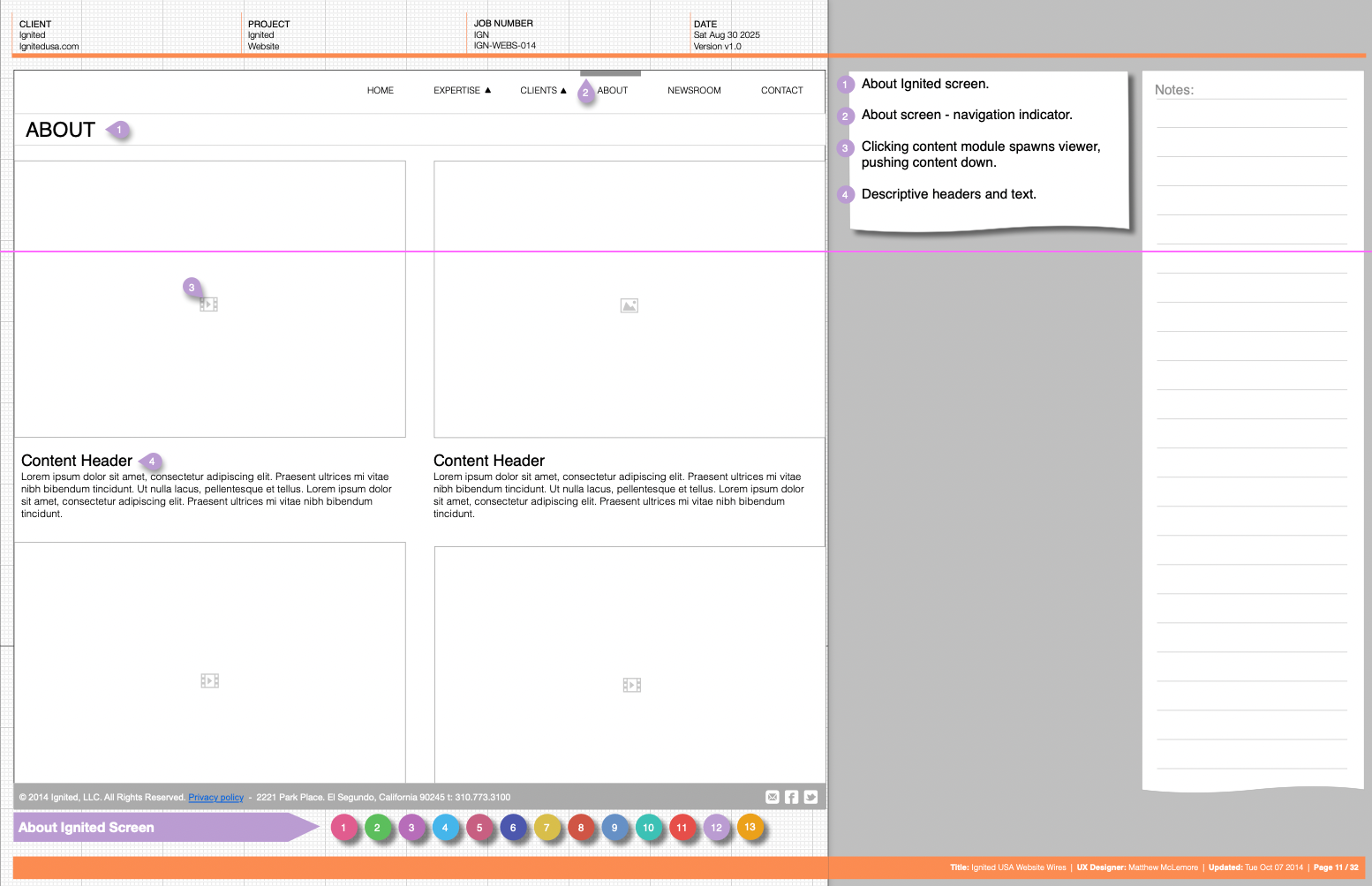
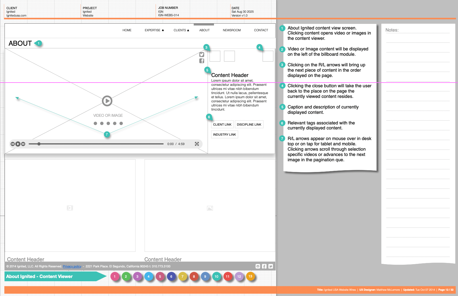
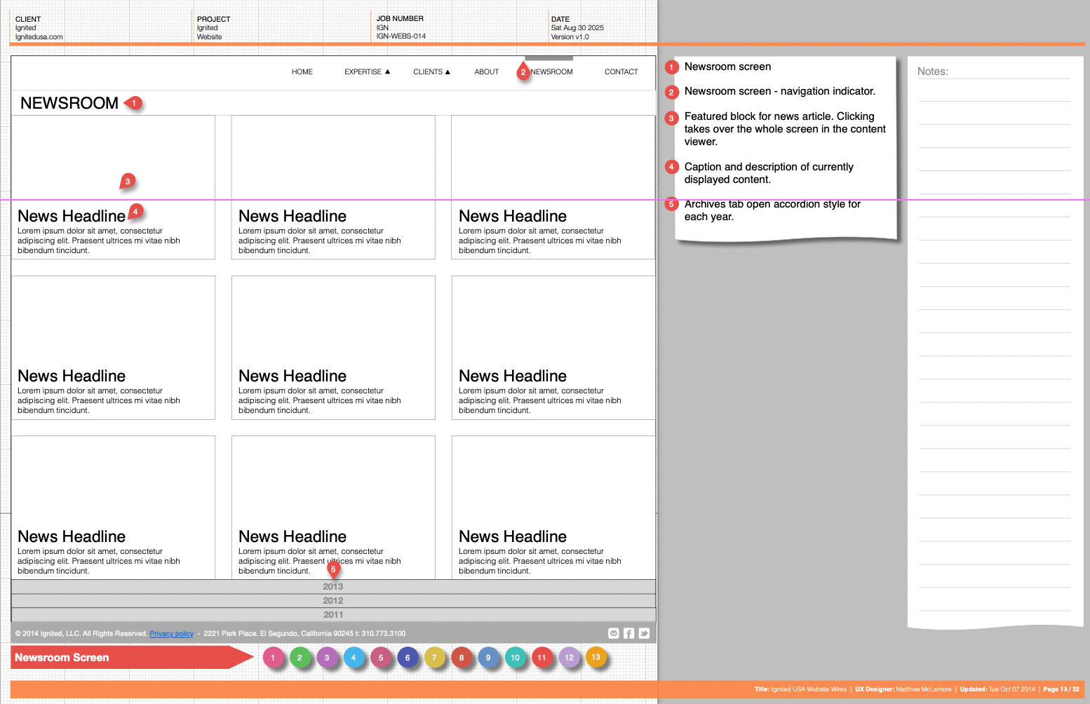
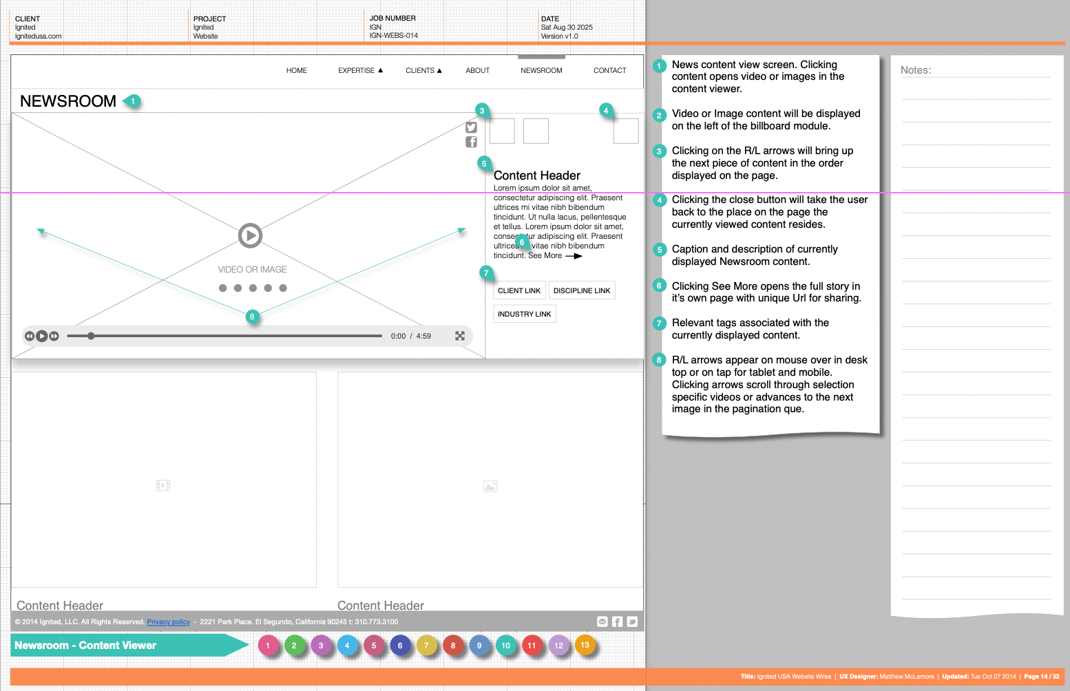
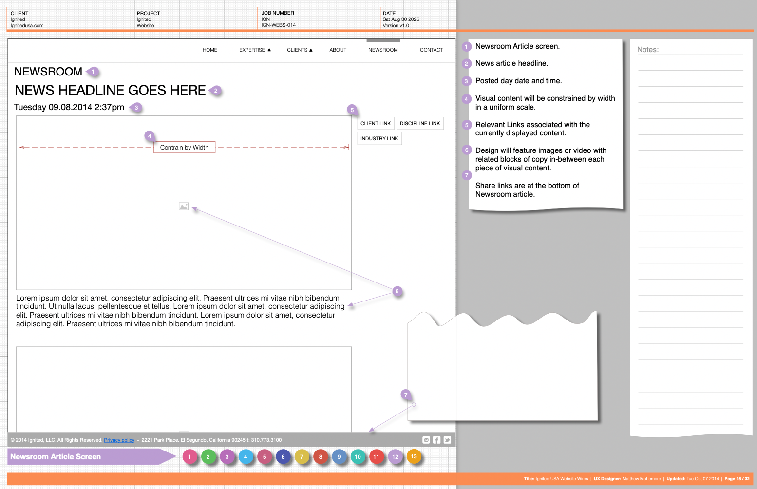
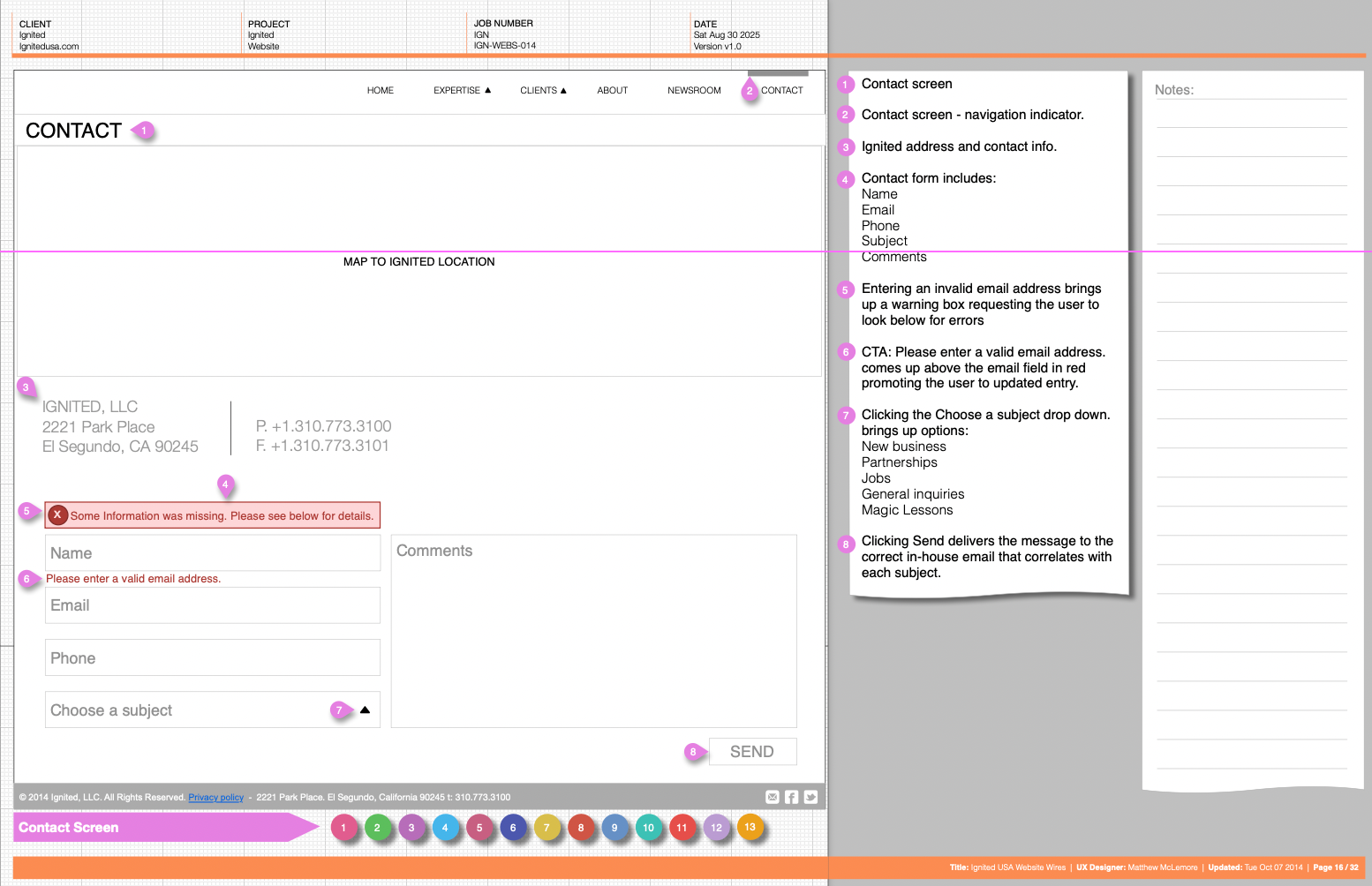
The Ignited Website User Flow
Outline key pages like Homepage, Expertise, Work, Client, About, and Contact, with navigation bars linking to subpages. Green lines show primary user paths from Google Analytics’ Behavior Flow, while red dashed lines indicate alternative routes. Annotations highlight UX improvements, such as adding video loops, responsive CTAs, and a dedicated pricing page based on Site Search data, enhancing navigation and user engagement.
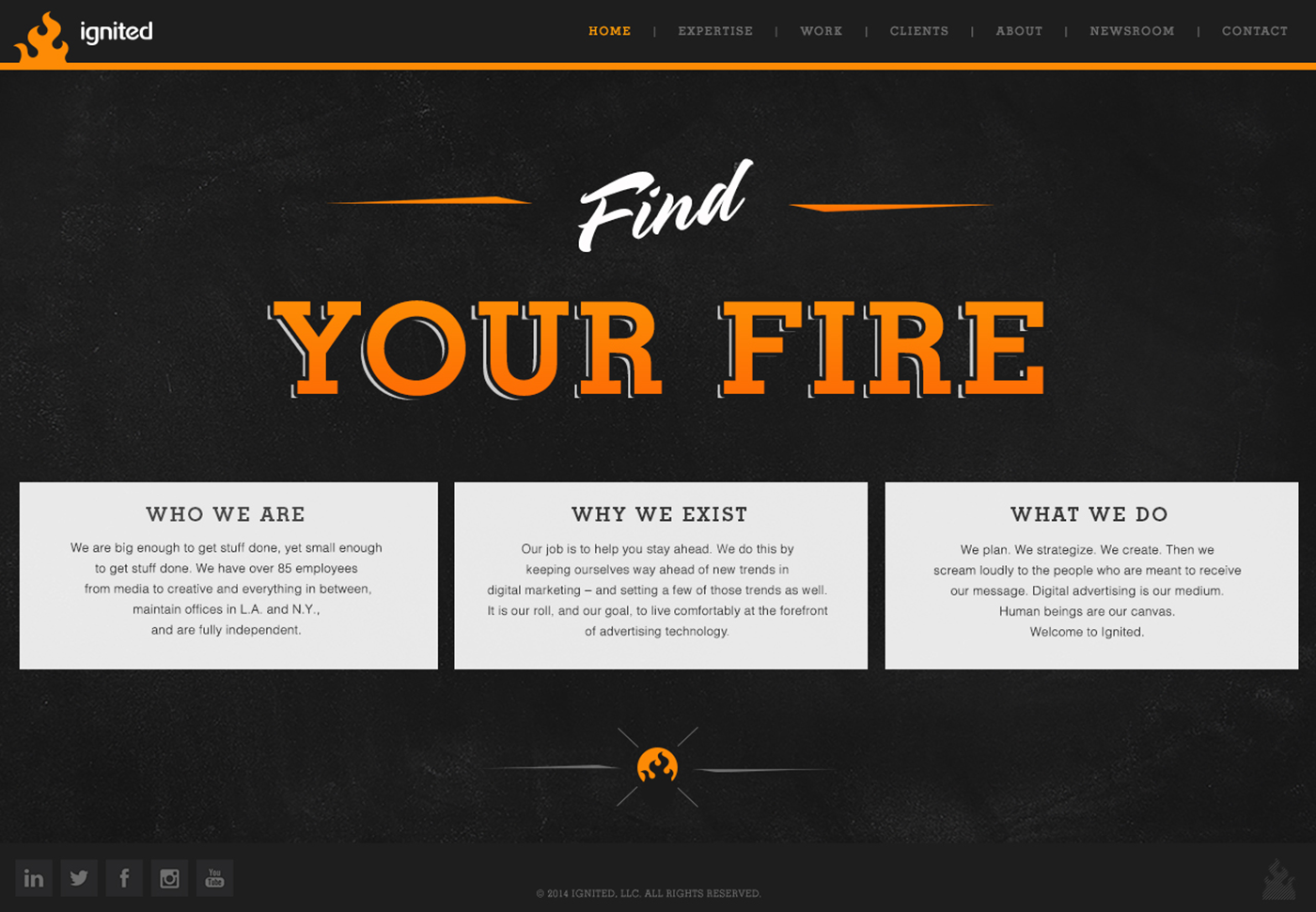
Ignited website design
Color Scheme
Features a deep black background as the primary canvas, paired with vibrant orange accents for headers, text, and interactive elements, creating a high-contrast, modern aesthetic that stands out.
Color Psychology
Black symbolizes sophistication, authority, and elegance, providing a sturdy foundation that reflects the agency’s professionalism. Orange, a warm and stimulating hue, boosts enthusiasm, creativity, and urgency, aligning with Ignited’s mission to ignite innovative advertising solutions. This duality appeals to a dynamic audience while reinforcing brand recognition.
Structure and Navigation
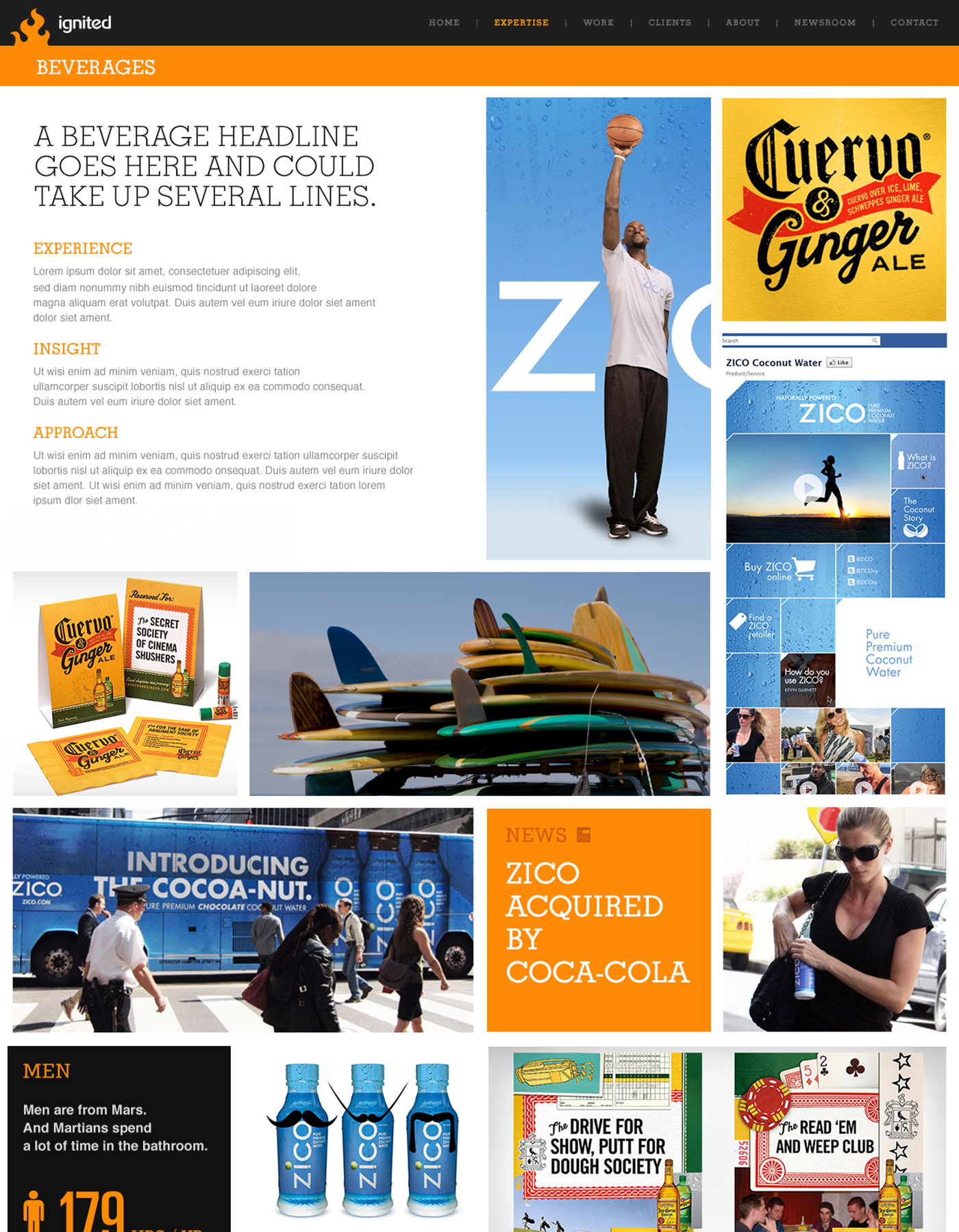
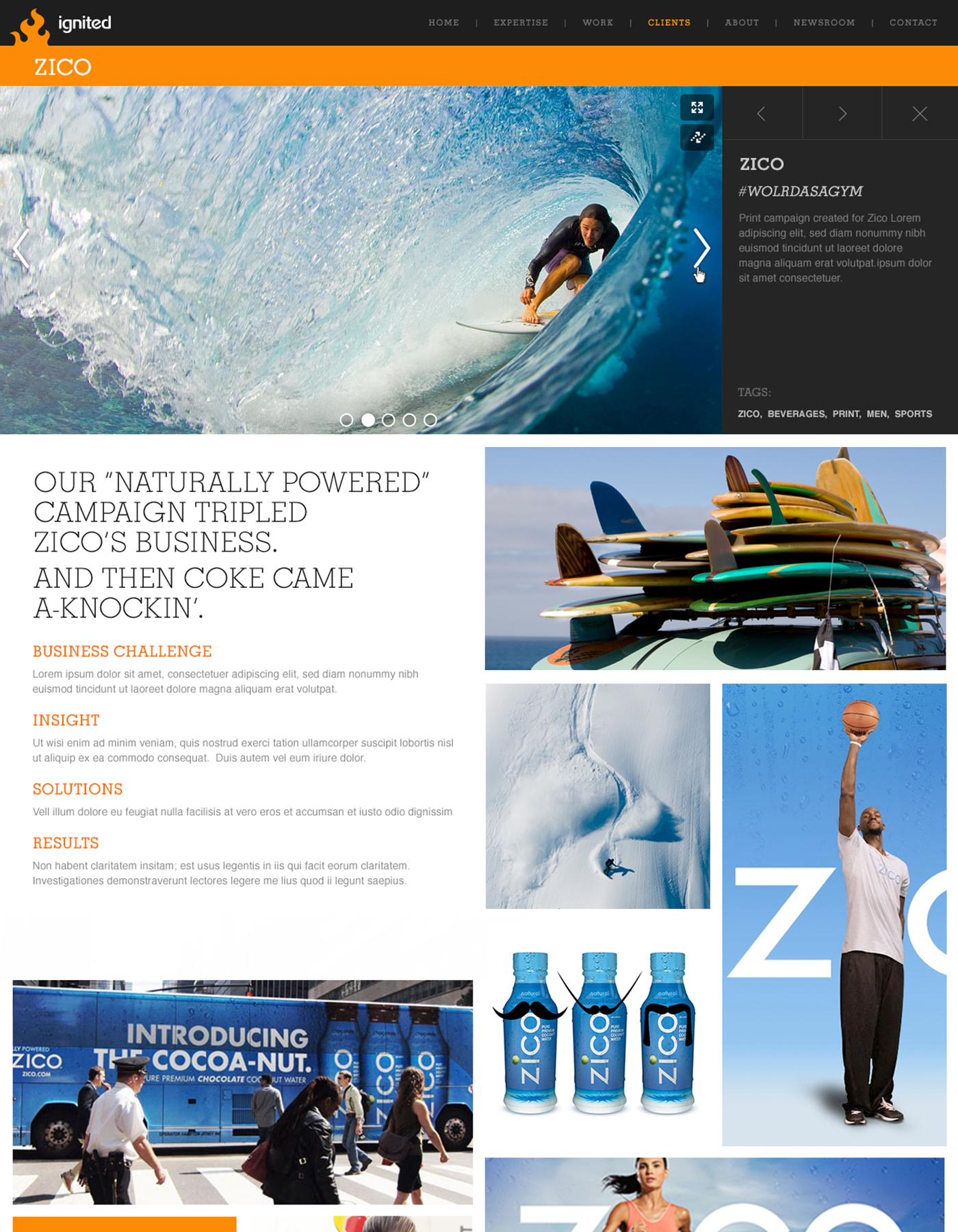
Centered around a selected vertical (e.g., Food, Fashion, Retail, Electronics), with the homepage dynamically tailored to highlight relevant campaigns, such as the ZICO coconut water campaign for the Food vertical, complete with product visuals and campaign narratives.
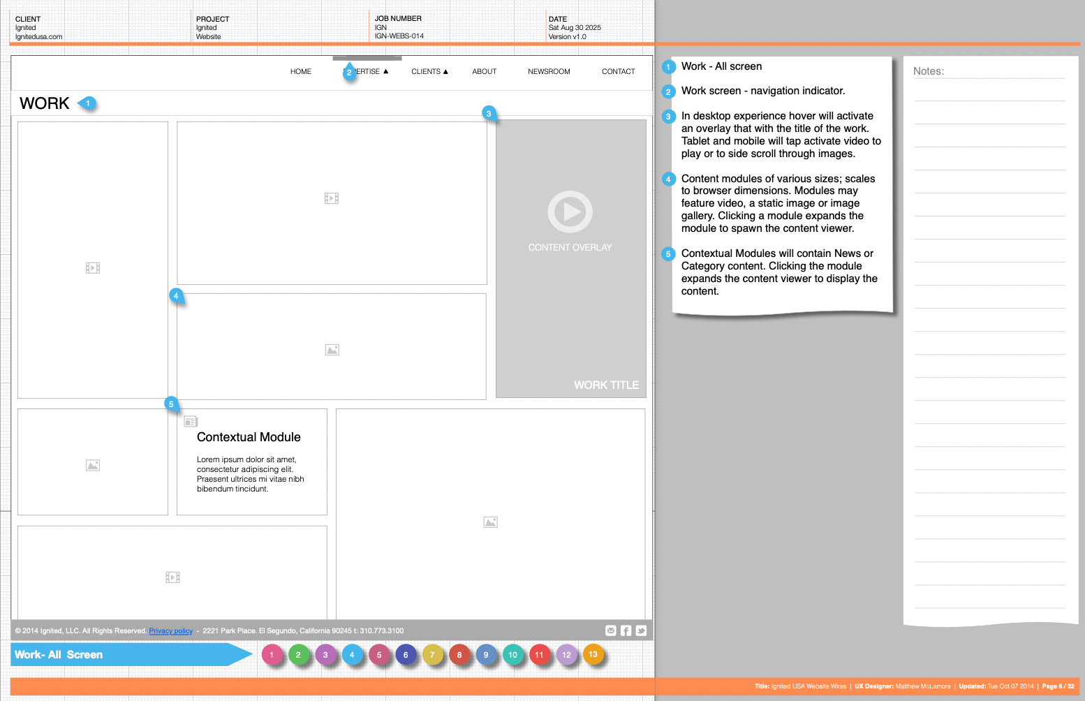
Employs a continuous scroll layout where non-selected verticals (e.g., Beverage, Sports, Travel, Government) progressively load with rich media, including images, and brief descriptions, ensuring users can explore the full scope of Ignited’s expertise without disrupting flow.
Employs a continuous scroll layout where non-selected verticals (e.g., Beverage, Sports, Travel, Government) progressively load with rich media, including images, and brief descriptions, ensuring users can explore the full scope of Ignited’s expertise without disrupting flow.
Layout and Content
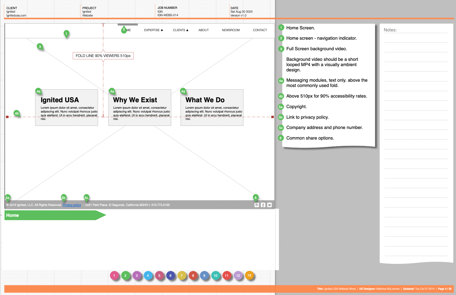
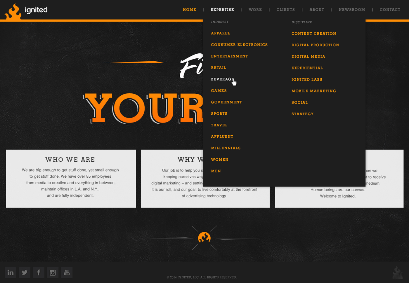
Opens with a striking header featuring the "Find Your Fire" tagline in oversized orange lettering, underscored by a subtle orange line, drawing immediate attention and setting an inspirational tone.
Below, three content blocks ("Who We Are," "Why We Exist," "What We Do") offer concise insights into the agency’s identity, mission, and services, each framed in white boxes for readability against the black background.
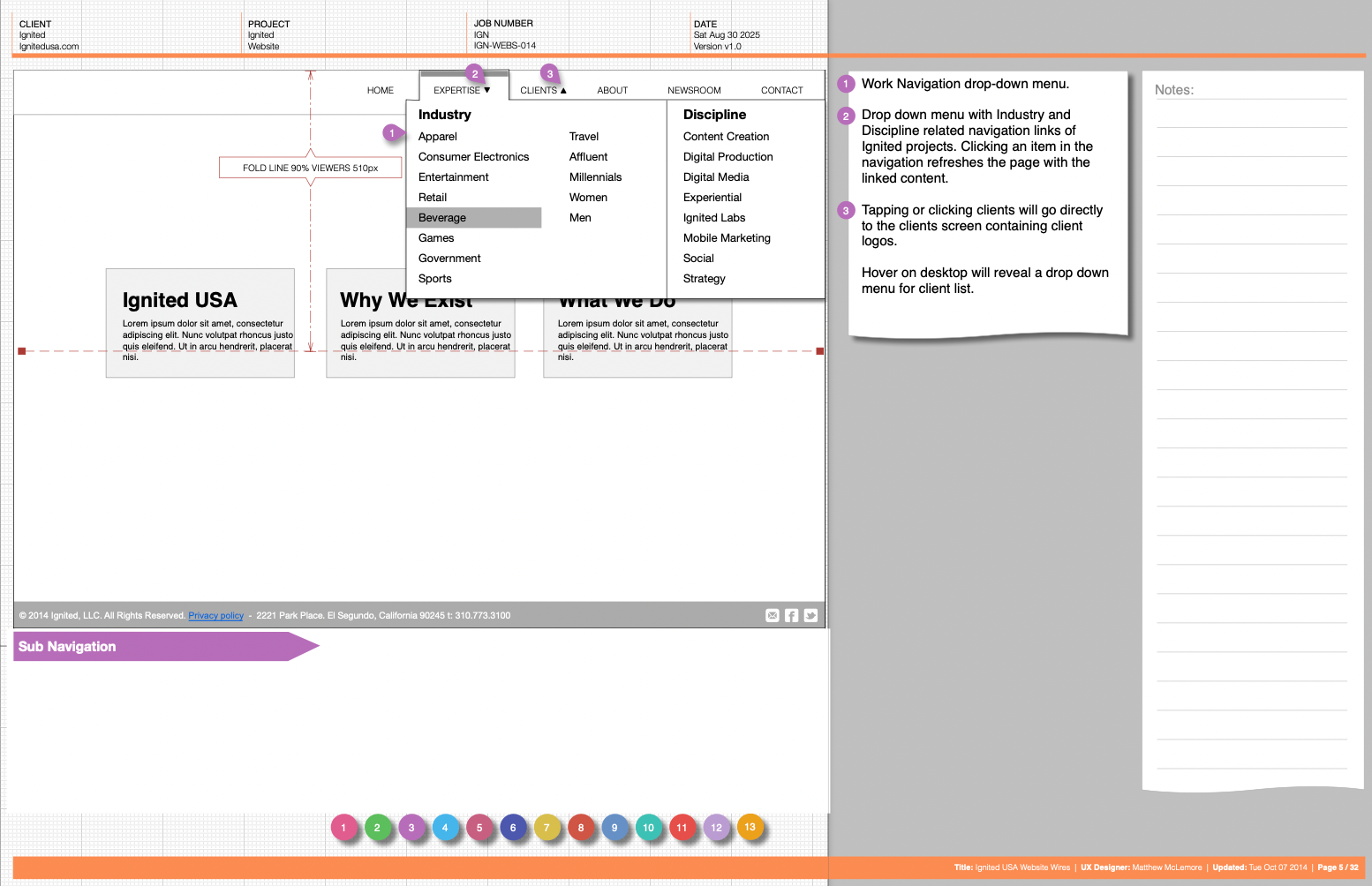
The Expertise dropdown menu expands to reveal industry (e.g., Apparel, Consumer Electronics) and discipline (e.g., Content Creation, Digital Production) categories, with orange highlights on hovered or selected items for intuitive navigation.
Below, three content blocks ("Who We Are," "Why We Exist," "What We Do") offer concise insights into the agency’s identity, mission, and services, each framed in white boxes for readability against the black background.
The Expertise dropdown menu expands to reveal industry (e.g., Apparel, Consumer Electronics) and discipline (e.g., Content Creation, Digital Production) categories, with orange highlights on hovered or selected items for intuitive navigation.
Visual Elements
Integrates high-quality imagery, such as surfing shots for ZICO and basketball scenes, to visually tie content to the selected vertical, enhancing engagement.
Includes social media icons and a footer with copyright details, maintaining a professional yet accessible feel, with orange accents tying the design together.
This design leverages color psychology and a responsive, scroll-based structure to create an immersive, brand-aligned user experience, adaptable to various verticals based on user selection.